Looking around us, everything is changing in the blink of an eye, so it isn’t shocking to see web design evolving. Yesterday’s design you see may or may not be on the trending list. They become outdated, except for some. There are billions of websites on the Internet. However, not every site gets the attention. Why? Because certain factors make them stand out from the rest, one of the reasons being the web design.
More and more new trends are gaining traction recently. Many websites have implemented such concepts to attract users, among which many have been successful in doing so. So to make your website look stunning, you also need to focus on the latest web design trends.
So, let’s look at the web design trends for 2022.
Web design trends 2022
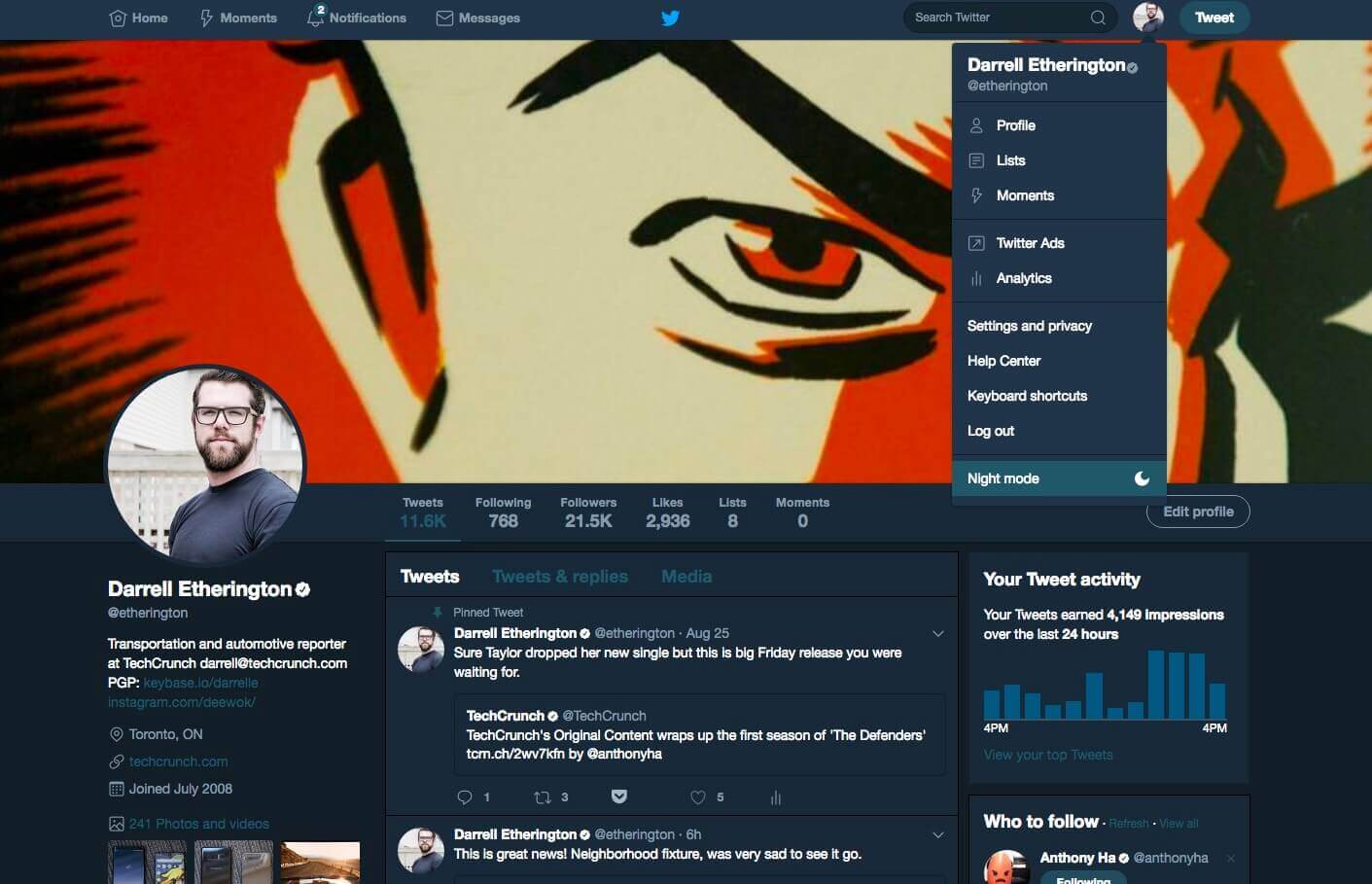
Dark mode
The dark mode isn’t a new trend. It has been for quite some time. However, 2021 was the year that most websites started implementing it. Since then it hasn’t stopped. Even the old sites are adding this feature.
With more people spending most of their time looking at screens, having problems in their eyes has become a common pattern. Thus, dark mode became a sensational trend since it is gentle to the eyes and doesn’t strain them. Moreover, it reduces headaches, sight problems, effects on the brain, etc., that are caused by longer screen time, bright light, and blue light.
Moreover, it highlights the content and elements on the websites pretty well, compelling everyone to have a dark mode on their apps and sites. So, the dark mode is here to stay even after 2022.
Example: Twitter
Neomorphism
Neomorphism is a new web design trend that is gaining attraction lately. Innovative design with a mixture of colors, flat design, and, especially, shadows blends perfectly on a website, giving a more vibrant look to a site. Mostly, it is seen on buttons, text boxes, borders, search bars, etc. However, in no time, we will be seeing it in every element, like forms, navigation, header, images, etc.
Interestingly, neomorphism makes an element look real. It mainly involves playing with shadows, giving more depth to the element. It is a new concept with a fresh look. And it won’t be long before many people start implementing it on their websites.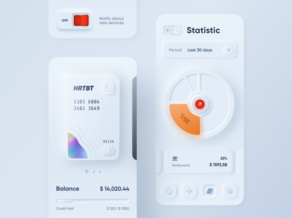 Image Source
Voice user interface (VUI)
Instead of typing, you ask a question and get your answer, such an easy way to access a website, right. With the introduction of Siri, Alexa, Google Assistant, the voice user interface revolutionized the web design, bringing it to a new level. Now, people can easily access a website, buy products online, search content, etc.
VUI helps users save time, which often goes to typing. Most importantly, it helps people who cannot see. It is still in the implementation phase. So, you rarely see it on any website. However, according to Statista, by 2021, 132 million people in the US will use a voice assistant. So, 2022 might be the year when people will start using VUI on their websites.
Chatbots
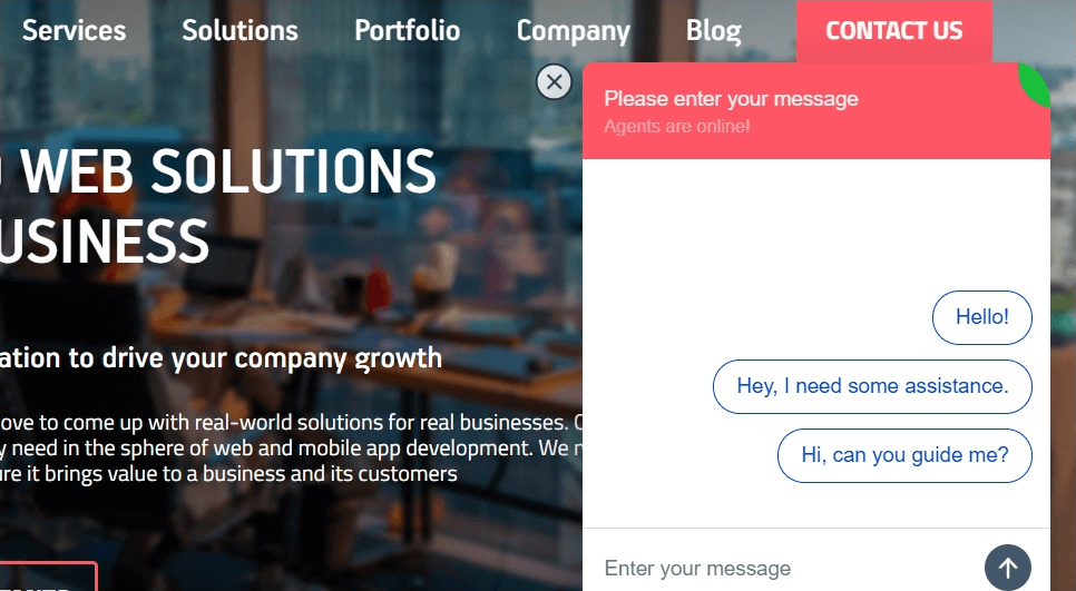
Another emerging trend is a chatbot. Using the Natural Language Processing (NPL) algorithm, the chatbot interacts with the users as humanly as possible. With the help of preset answers, they analyze the keywords and phrases used by the users and respond to them accordingly. Many websites have chatbots integrated into them and many are planning to do so. According to Outgrow, by 2022, 80% of businesses are expected to use chatbot systems.
Chatbots simplify things for the users on a website, so 69% of users prefer it because of quick replies to their questions. Nowadays, chatbots are becoming more human-like, so they can be seen on most websites.
Split-screen layout
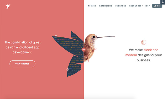
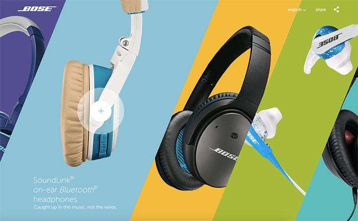
Even though split-screens layout became popular in 2016, recently we can see more and more use of it on websites. In it, two different elements are portrayed or a single element is emphasized using different colors, shapes, etc. And this trend is growing and evolving every year.
When you want users to see two or multiple contents, the split-screen layout becomes really effective. It encourages users to focus on multiple contents or make a choice in picking one. With the help of simple and innovative designs, you can draw the users’ attention quickly. Especially, it works well when you want to promote two different things.
Fluid shapes and design
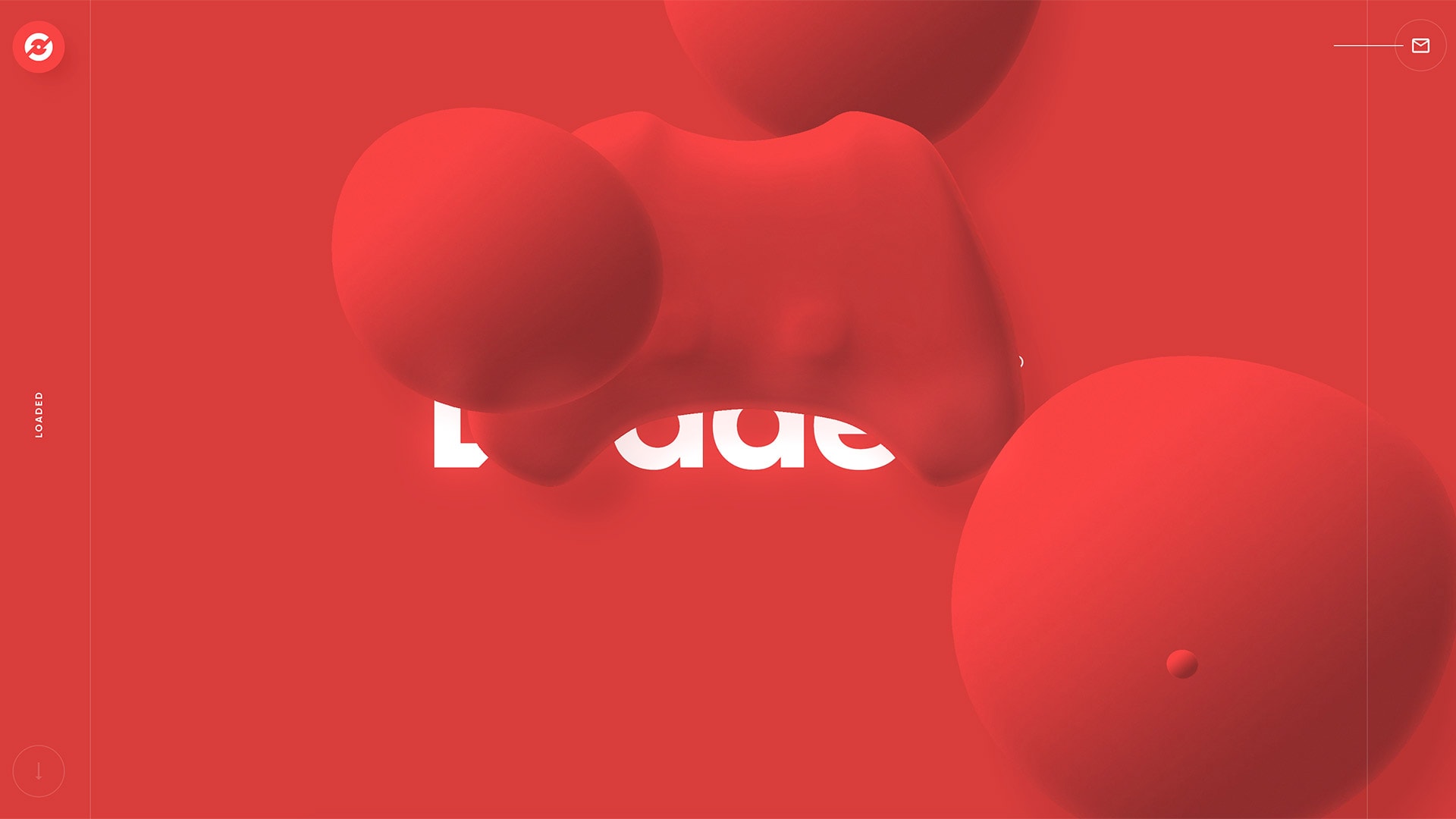
With the excellent use of shapes, the fluid designs feel like the shapes are naturally flowing into one another. Not to mention, the vibrant and comfortable colors are taking it to the next level. Recently, websites are incorporating this concept to make eye-catchy designs that are soothing and stunning. And in 2022, we will be seeing this trend even more.
Fluid shapes are making the user experience even more seamless and convenient.
Bold colors
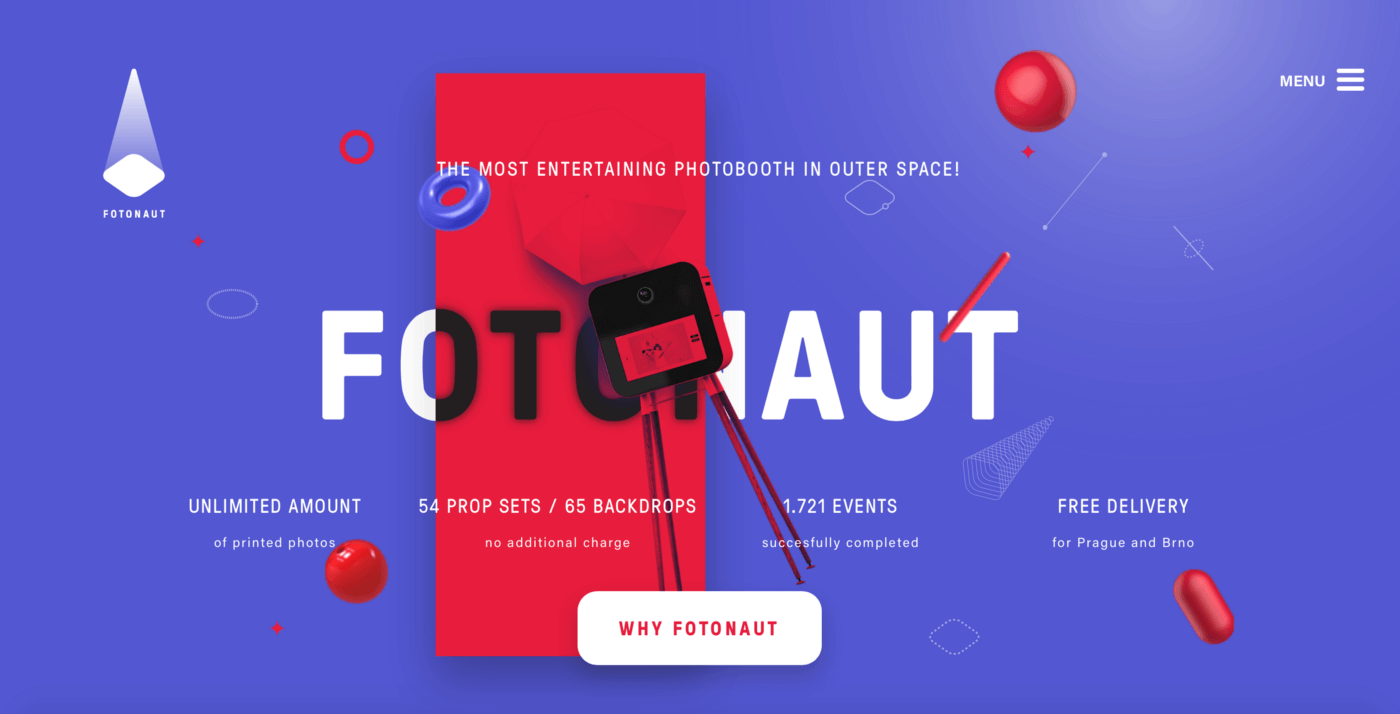
Colors have been part of the web design from the beginning and will remain forever. Bold colors are intuitive, attractive, and are here to stay for a long time. When paired and used perfectly with elements, shapes, text, etc., they make your designs bright, vibrant, gentle, and attractive without straining the eyes.
Moreover, bold colors help your website stand out from the rest and convey a clear message to the users. It influences their purchase decision, how they feel about the website, and make them focus on important elements. So, it is important to know the impact of colors on a site and how to use them to make your website beautiful and memorable.
White space
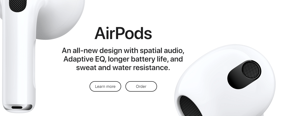
White space, also known as negative space, is an empty space between elements in web design. It isn’t a new trend. However, it has become and will be an important element in web design, where designers use it to make a website clean, make users focus on content, etc.
The main advantage of white space is that it prevents the websites from conveying too much information on the screen. Thus, helping the content and the design to stand out and focus on key information. If there is more white space, there will be fewer distracting elements for the users. However, it doesn’t mean to use too much white space, which is bad as well. So, learn how to use it appropriately for higher user engagement.
Dynamic content
Everybody likes to view dynamic content personalized for them only. Otherwise, they will leave and shift to the alternatives. They want information as much as possible to make their journey easier and seamless. And the websites with dynamic content has higher user engagement and retention rate. So, showing content based on their location, age, sex, behavior, interests, preferences, etc., is the new trend.
Without anyone noticing it, the users are preferring dynamic content because they don’t like to see the same content repeatedly. They want new information every time. This mostly helps E-commerce businesses. For example, showing recommended products based on their past purchase and browsing activities on the site.
So for a successful web presence, dynamic content is going to be a sensational trend in 2022.
Thumb friendly design
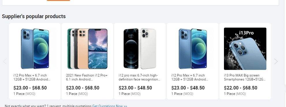
Since people are leaning more towards smartphones, the thumb-friendly design is a must now. According to Statista, there are over six billion mobile users in the world- out of which, 53% of consumers shop online every day. So, it is necessary to develop websites where users can easily surf it while holding the phone with one hand. In fact, many websites are mobile-responsive already. However, some sites aren’t.
With so many people going online with their smartphones, designers need to design websites that are easy to navigate with thumb only. So, no matter which era you are in, the thumb-friendly design will be one of the most significant web design trends.
Data visualization
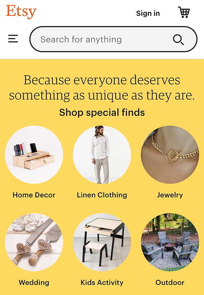
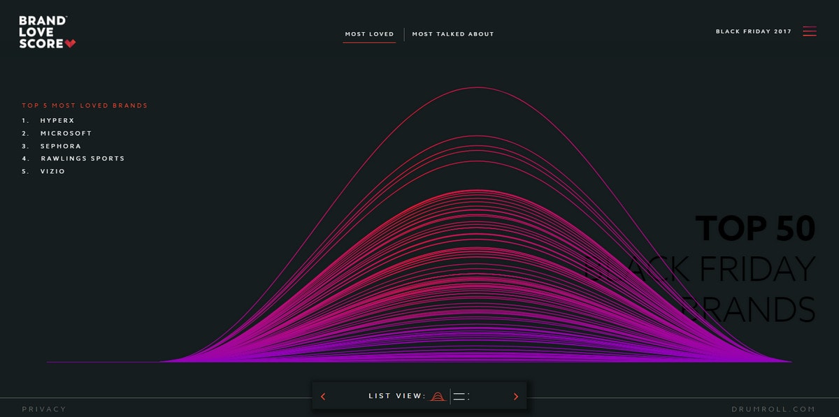
People prefer visuals like graphs, charts, figures, infographics, etc., more than text because they perceive more information that way easily. So in 2022, data visualization will be one of the rising trends. More and more websites will incorporate this concept because it helps businesses to convey messages to the users effectively and efficiently.
Since humans are visual creatures, the users are easily influenced by the facts and figures. As a result, it plays a vital role in affecting their purchase decisions. So in 2022, we will see more use of data visualization.
In Conclusion
These are some web design trends that will be in the hype in 2022 and beyond. However, we are in an evolving environment, so we can expect to see more beautiful and eye-catching designs.
With an experienced development team and record of successful projects and happy customers, Truemark Technology is a leading software company that provides the best development services that reflect your business goals and meet your needs. So, if you want a modern, clean, and user-friendly web design, contact us at any time. We would be happy to help you grow.
Cover Image Credits: PikiSuperstar from Freepik

2 Comments
Very interesting, Please share more.
Sure.