
The website has become the lifeline of a business. An essential means to boost user experience, revenue, and lead generation. So, it is necessary to understand the concepts and importance of a good web design.
According to Blue Corona, 48 percent of people said that the website’s design is the number one factor in determining a business’s credibility. So, how you present the information, how responsive your website is, UI and UX, etc., everything matters. Therefore, even a minor mistake on a site is enough to make the users leave your site and never return.
However, not only beginners, sometimes, even professional designers make errors. So, below we have listed some of the common mistakes in web design.
13 common mistakes in web design
Poor navigation
Navigation helps a user to know where they are and access the website without any trouble. However, the trend of fancying the navigation and menu has become a double-edged sword. In a sense, it makes your web design look aesthetically beautiful. However, at the same time, hidden links, overstuffing the menu, etc., will kill the user experience.
The ability to use breadcrumbs lets users navigate a site quickly. Every visitor wants their work to finish in an instant. If that isn’t the case, then it won’t take a second for them to leave your site. So, rather than making it harder for them, create a visible menu and not overstuff.
Also, make the navigation stand out from the rest of the elements on a site. Moreover, change the color of a visited link because it helps users know the visited and unvisited page, preventing them from wasting their time repeatedly going over the same page.
Here is an example of bad navigation.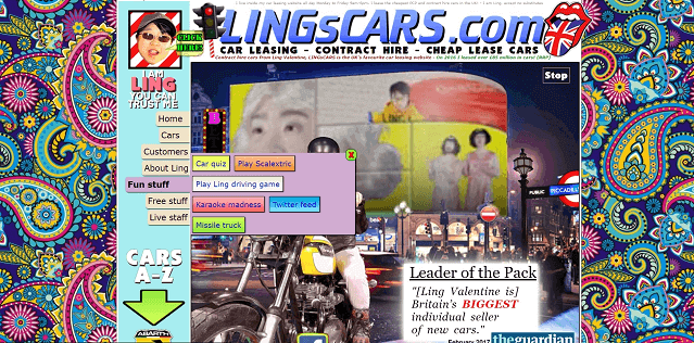 Source
Unorganized and improper use of spacing and colors on the navigation menu makes it look bad.
Instead, you can make a navigation menu as shown below.

Minimalist, excellent use of spacing, and in the right place make this navigation menu a great example.
So, make your navigation menu visible, clean, and easy to use.
Annoying pop-ups
Have you ever visited a website where a pop-up window appears the moment you land on it? Many websites do this. Pop-ups are great for boosting leads and gain tons of email lists. But, who would like to subscribe to the newsletter or take any action immediately after landing on a website? No one wants to do it without knowing anything about the site.
Moreover, there are websites with continuous pop-ups. When you scroll, go to the next page, or click a button, a pop-up always appears every time you do something. This doesn’t grow your email lists or make users use your service. Instead, they will be irritated with it enough to leave the site immediately.
As you can see above, the text, images, etc., are grouped too close to each other, making it harder for the users to know what’s going on. There is much going on in this picture, showing a bad example of pop-ups.
A user doesn’t want to be forced. They want to find what they are looking for. However, continuous pop-ups distract and confuse them.
So, continuous and early pop-ups are never a good practice.
Non-responsive
According to Statista, there are more than six billion mobile users worldwide. Out of it, 54.8% of website traffic came from smartphones in the first quarter of 2021. So, it is evident that building a responsive website is a must in this digital era.
However, sometimes, the websites are built in such a way that the content doesn’t fit on a mobile screen. The users need to scroll horizontally, which isn’t user-friendly. It is annoying that you need to pinch or scroll to surf the site. According to SAG IPL, 48% of users said if a website isn’t mobile-friendly, it means that a business doesn’t care about the users.
So, it is crucial to test whether the website is responsive or not before going live.
Slow-loading
According to Web FX, 47% of users expect a web page to load in two seconds or less. If a website is slow, the users will immediately leave it and look for an alternative. In this fast pace world, everyone wants everything faster. This is why many sites have a high bounce rate.
But, what could be the factor behind the slow speed? There are many reasons, like
- Large-sized images and videos
- Images and videos not optimized
- Excessive use of animations and effects
- Too many jQuery, JavaScript, etc., files
According to BP Studios, an increment in the site’s loading speed from 8 to 2 seconds increased the conversion rate by 74%.
So, it is a must to resolve the issues to make the site faster and smoother.
Improper use of CTA
One of the significant mistakes designers make in web design is the improper use of CTAs. A CTA helps users to take action on your site. However, sometimes, designers miss it on a website entirely. If you are selling a service or a product, you have to compel the users to buy it.
Here, you need to understand that CTAs are an integral part of a website to boost conversion rate. They guide the users to take your services and buy the products. So, making the CTA eye-catchy with the right information is necessary to let users take action. They need to know what they will get by clicking a button.
So, it is necessary to make CTAs clear and striking.
Here is an excellent example of CTA by Truemark.

It clearly tells users what to do and what they will get in return.
Not compatible with all browsers
Is your website compatible with all the modern and most used browsers? Not just mobile devices, but your website should be able to run on browsers. However, this is missed when designing a website. Sometimes, designers fail to test the site on different browsers. They simply try on the platform they are currently working on, which is a blunder.
Some users use Google Chrome as their primary browser. Some use Safari, Firefox, and so on. So, it is essential to test on modern browsers, if not all.
Absence of search box
If you are building an eCommerce site, it is necessary to create a search box, making it easier for users to search products they want. If they are made to scroll and switch pages until they get what they need, it will leave a bad taste. Consequently, they will leave the site immediately.
Instead, it is best to add a search box. It should be visible to everyone. Not only on an eCommerce site, but it is also essential on almost every site. It saves the users time and provides a seamless user experience.
Unorganized content layout
According to Blue Corona, 38% of users will stop engaging a site with an unorganized and unattractive layout and content. No one likes to surf a website with messy content. It prevents the users from taking any action. Even worse, they will never return seeing the poor use of grids, columns, images, and other elements.
Visually satisfying websites attract users and build trust among the users. So, it is better to make minimalist and clean sites with proper use of design elements, reflecting your brand’s vision and goals.
Sometimes, designers fail to use headings, subheadings, paragraphs, proper fonts, etc., making it harder for the users to read the content.
Here is an example of an unorganized content layout.
Avoid unnecessary elements and designs and use grids and columns properly to boost the user experience.
Autoplay of videos
Have you ever visited a website that autoplay videos with sound? It is irritating, right. Even if you are using videos, why make it play automatically? It is best to let the users decide whether they want to watch them or not. Otherwise, they might click the back button.
It distracts and interrupts the users what they are doing. They want a smooth user experience, not something that will make them leave immediately. There is no denying that videos play an essential role in attracting users. However, there are right ways to do it.
Let users decide what and when they want to play the video. It is better to embed videos hosted on YouTube.
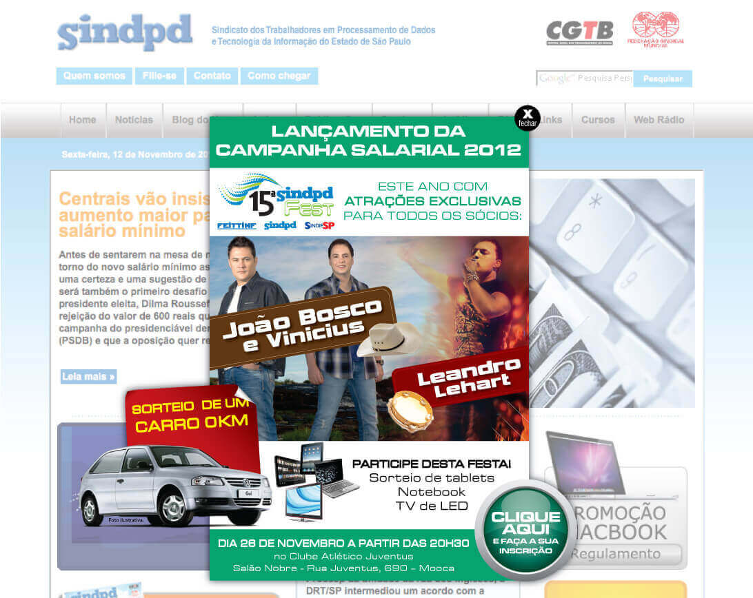
Too many advertisements
Too many ads on a website completely kill the user experience. Even if it is one of the ways to earn revenue, continuous advertisements are unpleasant. So, there should be only limited space for ads. Some sites have ads everywhere, from clicking a link to pressing the back and close button, which is a bad practice. This will only increase the site’s bounce rate, which again affects the ranking on search engines.
Here is an example.
In the above image, more than the content, you can only see ads. This prevents users from knowing what the site is all about and what it does.
So, it is best to avoid publishing too many ads on a website and only have limited space for advertisements.
Inappropriate fonts
Designers must know about the importance of fonts on a website. Most users love responsive and easy-to-read fonts. However, sometimes, designers go with the fancy or default typography, making it harder for the users to read the content. Sometimes, web designers fail to choose the correct typography and its size.
What if the size of the font is too small to read? What if the size of the font is too small to read? The users want the best user experience, not feel unpleasant seeing the fonts.
Here is an example of bad typography.
The mixture of background and typography makes it hard for the users to read the content. This must be avoided at any cost.
So, it is best to ensure that the font size isn’t too small to read. Plus, stick with limited fonts. It is a bad practice to have a different font style on every page. Instead, it should be consistent on each webpage. Also, have correct spacing between the texts, headings, paragraphs, etc.
Lack of information
To form a solid relationship and trust with the users, the website must have enough information. Lack of information only makes users hesitate to do any action, and they will leave the site. You will lose the chance to attract users and boost conversion rates.
Information is crucial for credibility. The users want to know whether you are legit or not. They can’t trust any website they land on. So, they look for a contact number, address, etc.
According to KoMarketing,
- 64% of users want to see the contact information of a company on the home page.
- 86% of users want to see information about products and services once they are on a home page.
- 44% of users will leave the website if contact information or phone number is unavailable.
So, as a designer, you should make contact information visible and accessible to the users. Almost every website has its mailing address on the bottom of the website. And the users expect the same. So, it is best to have it there. Also, have a separate contact us page for the users.
Moreover, use headings, break paragraphs, etc., to convey information more clearly to the users.
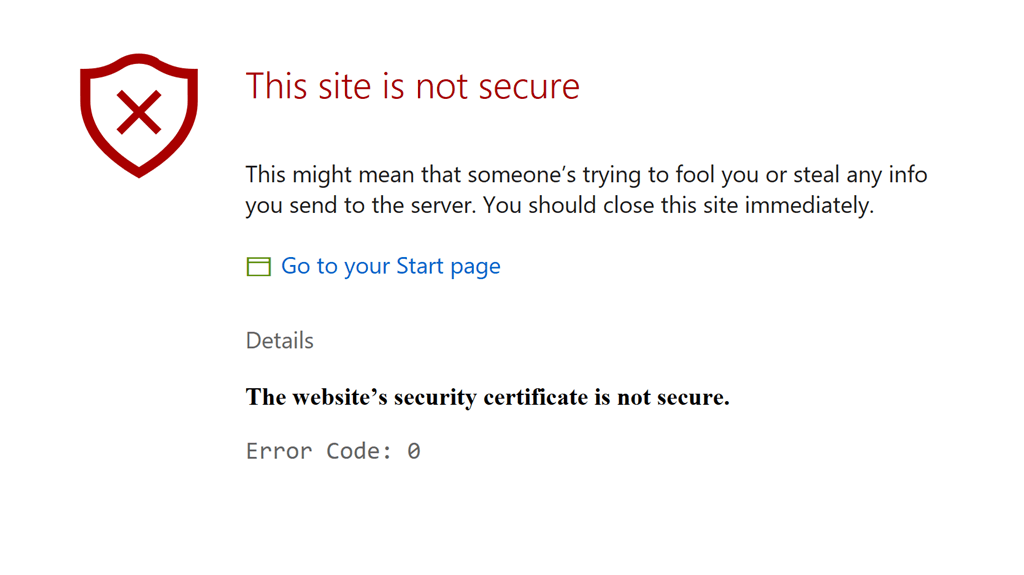
Insecure website
If a site isn’t secured, then the users will never surf the site. Data security is crucial in this digital era. Almost every information related to the users is now stored on the cloud. Many users still hesitate to provide their contact info and bank and credit/debit card details on a website. If these are lost, everything will be over for them. So, there is nothing more important than protecting their own privacy and data.
So, when developing a site, designers should consider this and strengthen the site’s security by using HTTPS, two-factor authentication, confirmation through email, etc. And as a user, it is best to check the site’s safety measures, like SSL certification, URL with HTTPS, etc.
The designers should always use the latest and updated APIs, libraries, plugins, etc. Also, they should check the security patch before utilizing them.
Moreover, nowadays, modern web browsers such as Mozilla Firefox warn users about the insecurity of the site.
Example:
In Conclusion
There are tons of mistakes in web design. However, these are the common ones. To avoid such errors, you need to understand the principles of good design. Still, flaws do occur during the development process.
While it is crucial to create an excellent website, it is also critical to understand what’s best for you and your customers.
If you are looking for a software company to help you design a website you need or redesign the existing one, please feel free to contact us. You can check out our portfolio section for design inspirations.


1 Comment
Pingback: 9 Ways To Manage Client Expectations In Web Design