
Imagine. You are looking for a product, and luckily, you get what you want and land on a website. But the design is unpolished, and everything is out of place. The page loads slowly, and you are confused. You can’t decide what to do next. So, the moment you enter, you leave it.
You might have heard about it, “the first impression is the last.” Your website is the core of your business and the only place customers land to buy your products and services. And if you think building a website is enough to attract them, then you are in the wrong world. Your website holds a dear place in influencing users to take the right decision, the action that you want them to take.
If your website design is unattractive, then you are telling the users not to come to you. You are literally driving them away.
Keep in mind that you need a well-designed website to attract users. If you are looking for a reliable development partner, then contact us right away.
That being said, here we have listed the 13 website design tips to attract customers.
13 website design tips to attract customers
Bring never seen mind-blowing ideas
One of the best ways to attract customers is to bring unique design ideas.
Who would have thought the frosted glass effect would create so much hype recently? Likewise, retro fonts made a comeback and people loved their usage on a website.
Similarly, if you can bring something that people have yet to see, then it will definitely attract them. Or, you can redesign old elements with modern techniques to give them a new look.
People love fresh and unique ideas. So, it is necessary to create a lasting impression.
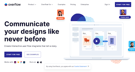
Here is an example of a unique design.
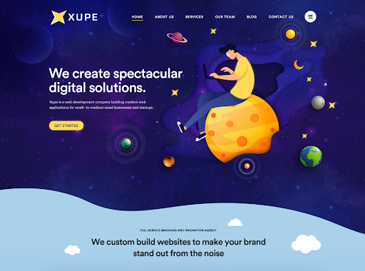
The best color combination with the illustration is making the web design look visually stunning. Not to mention, the fonts are blending perfectly with the design.
Make the landing page compelling
The landing page is the first page where your visitors land. If they see the unpolished design the moment they enter your website, then they leave immediately. If this spreads out, then no one will visit your site.
A landing page is a page that helps visitors acquire the necessary information they want. It helps them to take action and convert into leads. If it is unprofessional, then they will switch to your competitors. They might never come back for your products and services.
So, make your landing page attractive with relevant content and design elements.
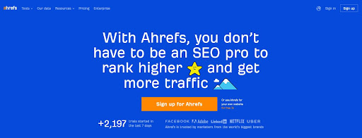
Just the right landing page for those who are consuming more time looking for SEO experts. This compels you to try Ahrefs.
Mobile-first design
Is your website mobile-friendly? If you are building a website, it has become necessary to make it device-responsive. There are currently over five billion mobile users in the world. Out of which, 79% of users buy products online via smartphones.
Imagine, if your site isn’t mobile-friendly, then how many customers are you losing every day?
How does it feel to browse a website with content and design elements that don’t fit your screen? It is irritating to pinch the screen every time you surf the site. This is a common blunder that drives away customers.
So, ensure your website is optimized for mobile devices.
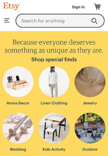
Simple minimalistic mobile-friendly design with no distractions.
Eliminate unnecessary elements
Less is best. Too many elements clustered on a page make it unattractive. Sometimes, it gets irritating. Nowadays, people like simple and minimalistic designs with stunning visuals.
When given more options, the users get confused, and unable to decide.
It might seem tempting to add lots of elements to attract users. It might seem right, but this is where many of you lose customers because they love when they have fewer options to take action.
If you truly want your customers to buy from you, then make your site simple. Give them fewer options to choose from. Make navigation easy. This way, you will make users do what you want.
Here is a bad example of web design.
Poor design with poor navigation, background, color combination, fonts, etc. Everything looks unorganized and unprofessional.
Hassle-free experience
User experience is the most important factor in designing a website. It keeps users hooked to a site and compels them to return again and again.
When talking about user experience, it should be hassle-free. Plus, you have to focus on lots of aspects. One is to make your site simple. It should be mobile-friendly, focus on the goals and objectives of a business, and be easy to navigate. The users shouldn’t have any problem finding what they are looking for.
You should look at the small details as well, like the position of fonts, buttons, etc.
You need to make sure that your website provides a seamless user experience to the customers.
Everything looks fantastic. Well-designed home page with a great color combination, bold fonts, navigation, and eye-catchy call-to-action button.
Focus on the user journey
One of the important aspects of a seamless user experience is the user journey. What you want users to do once they land on your website is what you need to focus on.
You want users to buy your products. So first, identify their pain points, then how your products solve them. Create user personas. This way, you will have an idea of how to fulfill their end goals and objectives.
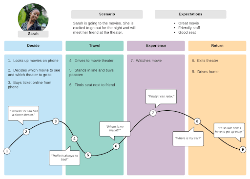
The user journey describes what users do after they visit your website.
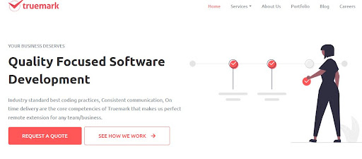
Here is a great example of a user journey.
Choose the best color combination
It is a no-brainer that color is another effective element in attracting customers. Color helps reflect your brand. Like how seeing blue colors reminds you of Facebook instantly, choose an appropriate color for your site.
However, it doesn’t mean you need to focus on a single color. Experiment with a unique color combination and select one that is warm and comfortable for the eyes. Also, remember to implement the same color combination on every page of your website, if not all. You need customers to stay on your page, not scare them away.
A good color combination helps customers to take action. Plus, they add freshness and uniqueness to the design.
Here is a great example of the right use of color.
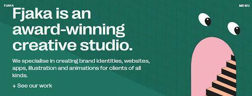
Not so bright, not so dim, just the perfect color.
Consistency is key
Consistency is key to attracting customers to your website. What does it feel like when you see different colors on different pages? It is irritating to the eyes.
What if the navigation menu is at the footer? It feels odd and hard to navigate the site because we are used to it being in the header. This makes your website a one-time site, where users visit once but never return because of the experience they had.
The consistent design provides a better user experience. It makes it easier for the customers to communicate with the site and easily find what they want. It helps them to settle down easily and be comfortable surfing your site.
Create compelling content
Content is still king. Without content, how does it feel to surf a site? It looks boring and uninformative. People love information. They want information about your business, your products, and your services. This helps them to make the right decision to buy your products and services.
Do you buy a product without seeing what it does, what ingredients it contains, and its benefits? Absolutely, no. Content is what compels users to buy products. They boost your traffic, leads, and revenues.
Content makes users come back again and again. So always focus on creating compelling content.
Fast loading speed
If a website takes over three seconds to load, then users leave the website. It not only leaves a bad taste to the users, but it also affects your website’s rank on search engines. It increases bounce rate, which tells search engines that your website is unreliable, directly affecting your visibility and traffic.
Some significant problems of the slow-loading site are adding too much of elements, unoptimized images, etc. So, you need to focus on a simple, minimalist design, but aesthetically beautiful.
Stunning visuals
A stunning visual is something that you shouldn’t miss. Gone are the days when a simple static HTML site was popular. Now, people love dynamic and responsive websites with stunning visuals and colorful interfaces.
Nowadays, users don’t only see how a website is helping them solve their problems, but they also notice how visually appealing a site is. They go hand-to-hand.
If a product solves a user’s problem, but the website is visually unattractive and unoptimized, then they don’t buy it. They do the same even if the case is reversed.
So, it is necessary to focus on visual elements plus design that solves users’ pain points.
Here is an example of web design with beautiful graphics.
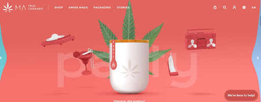
Great visuals, great color combinations, and great animations. Everything looks wonderful about this website.
Never miss call-to-action (CTA) buttons
Do you want to limit your users to just surfing? Or, do you want them to take action and buy products? Obviously, the latter. If so, then a call-to-action does that exactly. Call-to-action buttons like “Buy”, “Sign Up”, or “Contact Us” help users to take their next step. It guides them to their end goals.
But, ensure your CTAs are visible and depict exactly what you want them to do. If you want users to buy products, but your CTA says “Contact Us”, then it shows your incompetence in pulling customers.
CTAs increase conversation rates and boost revenues if used correctly. So, put your call-to-action buttons in the right place.
Here is how CTA should be used.
The vibrant CTA button with the right red color grabs the attention immediately.
Testing is crucial
Last, the most important part is testing. Look for the issues on the site. After you have designed a site, it is crucial to test it to ensure everything is working perfectly and there are no errors whatsoever.
When users face issues on a website, they get annoyed because they aren’t getting what they want. They are clicking a button to buy a product, but they aren’t able to checkout. They are redirected to a completely unrelated page. Your slow-loading web pages are irritating them. So, focus on these things and ensure your website is easy to navigate, usable, and solves customers’ problems.
Plus, keep updating your site because today’s design may not attract users tomorrow. It may become obsolete. So, it is necessary to keep up-to-date with the latest trends.
Read more: 15 Common App Design Mistakes to Avoid
In Conclusion
Website is the life of any business. So, making your site aesthetically beautiful is the first priority. It is the best way to boost user experience, traffic, sales, and revenues. So, here are the 13 website design tips to attract customers. These will help you design a visually appealing site. And to build a website successfully, you need a reliable development partner like Truemark Technology.
Truemark Technology is a software company with 5+ years of experience in software development. We will help you design a custom website that caters to your business needs. So, if you need a website that attracts users and generates leads, contact us. We will be glad to help you grow your business and be a part of your success.
Cover Image Credits: Freepik


